Sustained Investigation
INQUIRY STATEMENT
I want to investigate the aspects of visually telling a fantasy anti-hero's story and adapting the written word of a tale I craft into a graphic format. I want to explore everything from character and place design to mythical creature depiction to storyboarding and how the elements of art can be effectively used to tell a story.
Early Processes (old) Framed = considering using


Dimensions: Mostly 9 x 12 in. One 12 x 12, one 4 x 12, one 9 x 5
Materials:
Sketching pencil (HB), drawing pens, colored pencils, recycled sketch paper, alcohol pens, Krita and Photoshop.
Ideas:
-
The dragon stipple art was a first look at the themes -- the dark sun (eclipse) and the moon.
-
I specifically remember wanting to make Captain Greene, (a villain), look like the stereotypical golden-boy hero.
-
I really really really wanted to incorporate elements of the ancient Polish Calvary into Sunny's design.
-
. . . before I realized that a military organization like INRAE (InterNational Resistance Against Evil) would have uniforms.
Processes
Some of these are 2+ years old, and weren't in the best condition when I photographed them. A lot of "what if?"s essentially drove the process.
It was mostly to help me visualize and figure out the story at this point and not geared towards the creation of a graphic novel.
Some of these I cropped because they had other things on the page that were unrelated
Artists Referenced
-
Unfortunately, I wasn't in the habit of referencing master and current artists when I made these.
Mythical Creature Depiction Investigation


Dimensions: All done on 9 x 12 inch paper
Materials:
Sketching pencil (HB), drawing pens, colored pencils and recycled sketch paper.
Ideas:
-
I wanted to create my own ideas of how to depict these creatures, but while also adhering to the original descriptions/depictions.
-
Effectively combine the original depictions with something modern audiences would recognize.
Processes
I looked at both ancient and contemporary depictions for each design I wanted to do in order to create the fantastical creatures that would inhabit a world based on Earth. This set of mythological creatures are some that inhabit the continent of light (the Human Nations). Most of these designs I will use to make characters granted with their powers, and some will appear in the story themselves. (FYI, this is a more demon heavy story in terms of mythology, so we don't see a whole lot of creatures of light playing active on-page roles in the story.)
A lot of the time, there were some major differences between original depictions and what pop culture has made it into.
Artists Referenced
-
Chen Rong, Yu Sheng & Zhang Weibang, Michelangelo, Leonardo Da VInci
-
Lampp0st, Fenshui Monster, Drakinator, Marnah, R.J. Palmer, Richard Garfield.
More Mythical Creature Depiction Investigation


Dimensions: All done on 9 x 12 inch paper
Materials:
Sketching pencil (HB), drawing pens, colored pencils and recycled sketch paper.
Ideas:
-
I wanted to create my own ideas of how to depict these creatures, but while also adhering to the original descriptions/depictions.
-
Effectively combine the original depictions with something modern audiences will recognize.
Processes
I essentially started shifting towards looking more at oral descriptions for the demon types that weren't depicted in art.
This set of mythological creatures are some that inhabit the continent of darkness (the Demon Lands). Unlike the last set, these are all pretty much what the characters will look like (with variation characteristic to each demon type, of course).
As an additional note, the fairy/faeries are a more ambiguous species with some on both the light and dark continents.
A lot of the time, there were some major differences between original depictions and what pop culture has made it into. Especially with Native folklore.
Artists Referenced
-
Ancient Greek vase painting (gorgon), traditional oni mask, (Both artists unknown.) Johan Henrich Fussel, Leonardo Da Vinci
-
George O'Connor, Vivienne Medrano, Lampp0st.
Brush Tip Pen Inking Exploration

Dimensions: All done on 9 x 12 inch paper
Materials:
Drawing pens - brush tip
Ideas:
-
I wanted to investigate the properties of the brush tip pen and see if I could achieve the desired line thickness variance effects with it.
Processes
I essentially picked up my own brush pen from my small pens set at home and started playing around with it. I found out pretty fast that my motor control when holding the brush properly is not the best. I was having trouble getting the thinner lines, so I switched to a pen with a skinnier brush tip from among the classroom materials and that had better results.
Artists Referenced
-
Bill Watterson (Calvin and Hobbes artist/creator.)
-
Lampp0st, several other random graphic novel pages that popped into my head that I remembered specifically because of the inking.
Character reference sheet (Part 1)

Dimensions: All done on 12 x 9 inch paper
Materials:
Drawing pens, graphite pencils, colored pencils.
Ideas:
-
I wanted a reference sheet where I could compile all the loose old sketches/concepts still floating around in my brain into something cohesive.
-
Since the first third of the story takes place at a military organization, everyone has uniforms (more detail shown in old art gallery). It's also a nice contrast with the demon characters shown in part 2.
-
Because of the latter, I had to find ways to make the characters stand out from each other that didn't rely on clothing. Let's say INRAE's more lax about hair, since that's a huge part of many cultures.
Processes
This story concept has essentially been with me since Freshman year, so I didn't just make this from scratch. I had their descriptions in the written story that were strongly connected to an image in my mind, and a few early sketches of some of the main characters.
I had my mom (who knows nothing about character design) try to guess from this who the main character was. She got it narrowed down to two (Juniper and Eclipse), which is a pretty good start for me. (The actual MC is Eclipse.)
I don't think colored pencils will be the best tool with this project.
Artists Referenced
-
This is an idea I got from a book explaining the making and concept art that went into the PIXAR film: Luca. Deanna Marsigliese -- character art director.
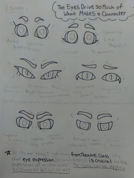
Characterization through eyes Deep Dive
Dimensions: All done on 9 x 12 inch paper
Materials:
Drawing pens, graphite pencils.
Ideas:
-
I had some trouble with some of the characters' eyes. (My mom confused arrogance for rage-prone jerkwad characterization (Bottom two).)
-
It actually started with realizing how valuable eyelashes can be for accentuating the eye shapes -- I was not doing eyelashes previously.
Processes
Essentially compiling my experience in theatre with what I knew about character design and human expression.
Artists Referenced
-
Charlie Chaplin (not a visual artist, an actor, but is really good for watching and learning facial expression in characterization.)
-
Japanese anime really relies heavily on the eyes for characterization (although that's not my art style for this project). I also looked at tv shows with art styles closer to my own such as Noelle Stevenson's She-Ra and the Princesses of Power.
Character Progression & Reference Sheet for Eclipse/Foeslayer

Dimensions: about 18 x 12 inches
Materials:
Mechanical and colored pencils for sketching on sketch paper, Brush tip and fine tip pens, correction (white) ink, and alcohol markers for a finished, cartoon look on multimedia paper.
Ideas:
-
Symbolisms: Hair -- ponytail = holding back; long bangs in pt. 2 = trying to hide her power (glowing eyes are the first symptom at the lowest point in the state.); growth of hair = growing backed clipped wings. Clothing -- ruined uniform = something along the lines of a square peg not being able to fit in a round hole; humanlike clothing in pt 2. = "human wannabe" accusation. Losing jacket (rips beyond repair) during Lunar Eclipse Festival = beginning of rejection of human society & INRAE.
-
Unique leader-symbol-of-power (not a crown or an overly decorated military uniform): shiny black strips that are sorta pasted on like a second skin, but can be removed.
-
For the issued T-shirt, I rearranged the stripes on the Adidas logo. (World building -- human society is capitalistic.)
Processes
Interpretation of verbal descriptions and character symbolism throughout the story. Facial expressions practice and seeing how the facial markings would contort with each expression. At one point, I questioned my usage of the brush-tip pen and tried using only the fixed-tip ones, but nah. I actually like the texture that results from the brush tip and my shaking hand. It kinda fits the character too, and the story as told from her perspective. Lotsa trial and error with using the white ink (fixed ballpoint width and takes FOREVER to dry -_-) and figuring out how to correct the correction ink without ruining the black pens. The positions I used were taken from older drawings of this character.
Artists Referenced
-
I referenced Deanna Marsigliese (character art director for PIXAR's Luca, which has sea-monster characters who can shape shift into a human form, similar to an oni.) Also Amy Sherald with how colors, pose and clothing can be used to contrast the inner person with how they're expected to be and perceived on the outside.
-
I should probably give Ninjago some inspiration credit for the color schemes.
Martial Arts as a Magic System

Dimensions: about 9 x 12 inches
Materials:
Mechanical pencil on sketch paper.
Ideas:
-
In Tang Soo Do class, (which is a Korean form of karate), I would always imagine the forms being performed with magic (aside from the already amazing physical applications).
-
These are specific techniques taken out of the forms to see how I could portray magic with them.
-
Three different breathing/energy styles: hard, where all the energy is released on extension; soft where the energy is expelled throughout a fluid motion; and half and half, where the motion is still fluid, but with most of the energy expelled at the end.
Processes
I went through the forms and combinations I know well enough to portray and selected specific techniques that I could easily see a magical application for in fictional world building. I thought long and hard about how these four forms of -kinesis would behave according to the principles of each energy form.
Artists Referenced
-
In the classes I attend, my Kyo Sa (Certified Instructor) is a disciple of Grandmaster Andy Ah Po, who brought Tang Soo Do to the United States. A Grandmaster would be a master artist. We have also had a few Sa Bom (Master Instructors) come into class. Also technically a master artist.
-
Demon Slayer is a show (well, an anime) that also combines martial arts and magic. And Avatar: The Last Airbender. I got the idea for the hard style properties of shadow from the main villainess in Disney's Rapunzel's Tangled Adventure
Character reference sheet (Part 2)

Dimensions: All done on 12 x 9 inch paper
Materials:
Drawing pens, correction ink, graphite pencils, colored pencils.
Ideas:
-
I wanted a reference sheet where I could compile all the loose old sketches/concepts still floating around in my brain into something cohesive.
Processes
This story concept has essentially been with me since Freshman year, so I didn't just make this from scratch. I had their descriptions in the written story that were strongly connected to an image in my mind, and a few early sketches of some of the main characters.
Artists Referenced
-
This is an idea I got from a book explaining the making and concept art that went into the PIXAR film: Luca. Deanna Marsigliese -- character art director.
-
For the Dark Sorcerers' robes (seen on Plaugesmaster), I drew inspiration from Shadow Weaver from Noelle Stevenson's She-Ra and the Princesses of Power.
Character Reference Sheet for Significant Side Characters

Dimensions: 18 x 12 inches
Materials:
Mechanical and colored pencils for sketching on sketch paper, Brush tip and fine tip pens, correction (white) ink, and alcohol markers for a finished, cartoon look on multimedia paper.
Ideas:
-
For Dragonsbane, I really wanted to use a color palette based off the trans flag, since it's not mentioned very much in the story itself. Her white-on-blue facial markings are based on Zuko's blue spirit mask from Avatar, the Last Airbender.
-
For Juniper's headscarf design, I combined elements of different earth-based religions, chiefly Christianity (the silver scarf pin sorta being like the holy cross necklace), Islam (which it ended up mostly resembling, still) and Hindu, (which was the version of headscarf I was going for -- a bit less conservative with the hair.)
-
Looking back at the written book, I realize that Anacondria is kinda ADHD-coded and Ash is kinda Autistic-coded, so I tried to emphasize that here.
Processes
Interpretation of verbal descriptions and character symbolism throughout the story. Facial expressions practice and seeing how Anacondria's snakes would match each expression. I chose the postures for each character based off the vibes I got when I listened to songs I think matches very well with their personalities and basic character arcs. I didn't have enough space to do a full development for each, so I pretty much just filled in the gaps that weren't already covered by other pieces. There was some trial and error with Dragonsbane's facial markings with the white correction ink on the blue. Maybe I don't use the correction ink for such detailed thingies. I also thought it would be humorous to emphasize the contrasting backgrounds of Rocky and Sunny through a royal portrait versus a mugshot. Maybe I could put those into color later.
Artists Referenced
-
I referenced Deanna Marsigliese (character art director for PIXAR's Luca, which has sea-monster characters who can shape shift into a human form, similar to an oni.) Also Amy Sherald with how colors, pose and clothing can be used to contrast the inner person with how they're expected to be and perceived on the outside.
-
I referenced images of grizzly bears for Rocky's werebear form. Dragonsbane's white-on-blue facial markings are based on Zuko's blue spirit mask from Avatar, the Last Airbender.
Character Reference Sheet for Main Antagonists

Dimensions: 9 x 12 inches
Materials:
Mechanical and colored pencils for sketching on sketch paper, Brush tip and fine tip pens, correction (white) ink, and alcohol markers for a finished, cartoon look on multimedia paper.
Ideas:
-
For The Dragon Master's armor, I wanted to combine elements from the Japanese Samurai and the European Knights with a dragonesque design.
-
I thought appropriate facial markings for Warbringer would be ones that accentuated a sinister, grin of triumph . . . but you wouldn't know until it was too late.
Processes
Interpretation of verbal descriptions and character symbolism throughout the story. I chose the postures for each character based off the vibes I got when I listened to songs I think matches very well with their personalities and basic character arcs. I didn't have enough space to do a full development for each, so I pretty much just filled in the gaps that weren't already covered by other pieces.
Artists Referenced
-
I referenced Deanna Marsigliese (character art director for PIXAR's Luca, which has sea-monster characters who can shape shift into a human form, similar to an oni.) Also Amy Sherald with how colors, pose and clothing can be used to contrast the inner person with how they're expected to be and perceived on the outside.
-
I based the design for the humanoid dragon creatures off how the show Chima depicts their races of humanoid animals.
Location Reference Sheet for Crystalline City

Dimensions: All done on 12 x 9 inch paper
Materials:
Mechanical pencil, colored pencils.
Ideas:
-
I thought the throne could look like a flower in profile . . . but could also be mistaken for a sea urchin :)
-
I needed to have these places of power not radiate the addicting Cheeto dust. Doing the Citadel in context with the rest of the city -- kind of having it blend in -- and making the office a bit cozier worked. The throne and risers should also kind of blend into the shadowy hall.
-
The city in of itself needed to have an overcrowded feeling to it -- especially the hospital.
-
When I watched the Lord of the Rings, Return of the King for the first time (recently), and saw Minas Morgul, I was like, "There! Right there! That looks like the Midnight Citadel!"
Processes
This story concept has essentially been with me since Freshman year, so I didn't just make this from scratch. I had their descriptions in the written story that were strongly connected to an image in my mind, and a few early sketches of the Citadel and the Great Hall.
Artists Referenced
-
Gustave Eiffel for the Eiffel Tower shape for the Midnight Citadel.
-
Minal Morgul from the Lord of the Rings cinematic adaptation for city color schemes and villain Cassandra's spiked throne from Rapunzel's Tangled Adventure was used as inspiration for the throne in the Great Hall.
Location Reference Sheet for INRAE HQ

Dimensions: All done on 12 x 9 inch paper
Materials:
Mechanical pencil.
Ideas:
-
Have a mix between the older buildings native to the area (Japanese-based) and more modern buildings.
-
I thought the inside of the Grand Temple could have paintings of supernatural creatures of Light and Goodness, sorta like the Sistine Chapel.
-
The Jetcopter was a weird idea that came out of an inconsistency in my first draft.
-
When I watched the Lord of the Rings, Return of the King for the first time (recently), and saw Minas Tirith, I was like, "There! Right there! That looks like the INRAE HQ!" (Pretty interesting coincidence that it happened for both.)
Processes
This story concept has essentially been with me since Freshman year, so I didn't just make this from scratch. I had their descriptions in the written story that were strongly connected to an image in my mind, and a few early sketches of the Jetcopter and Delta 13's room.
Artists Referenced
-
I based the Grand Temple off of both Bruneschelli's Dome in Italy and the Ancient Greek temples.
-
Minal Tirith from the Lord of the Rings cinematic adaptation for the layout schemes and the library from Southern Utah University (yeah, it reflects the noon sun into your eyes if you stand in the wrong spot on the lawn).
World Map

Dimensions: about 9 x 9 inches
Materials:
2H and 2B pencils on sketch paper, then photographed and added text to it on Krita.
Ideas:
-
I really liked the idea of an inverted yin/yang for a world map reflected across the equator.
-
I wanted to make sure the major societies of the world were represented in the Human Nations. (This is heavily based on Earth.)
Processes
Making this involved a lot of looking at the world map as a geographical reference, as well as getting inspiration for the country names from Google Translate. Some, I combined elements of different words, if it was a nation based on many Earth-nations, and some I just left as is.
For the Demon Lands, I used only geographical names because their natural state is anarchy (meaning, no countries). For the society part of the world building, I took everything about human society and reversed it to get a basis for the demon society.
Artists Referenced
-
I referenced Greyson Perry's "Map of an Englishman", which combines witty political commentary with world building. I'm not sure if the world map counts as a "master" reference, but I used that a lot too.
-
Several maps from my favorite childhood fantasy series such as Wings of Fire (which I found doesn't hold up very well geographically). Christopher Paolini was the best example I could find of a good fantasy map, though his place names are mostly based on Germanic languages. I should probably also give Ninjago some credit.